Test Tasks for Yousician: App and Landing Page Redesign
Based on Yousician mission "to make musicality as common as literacy." I have defined the style as casual, clean, intelligent, and optimistic.
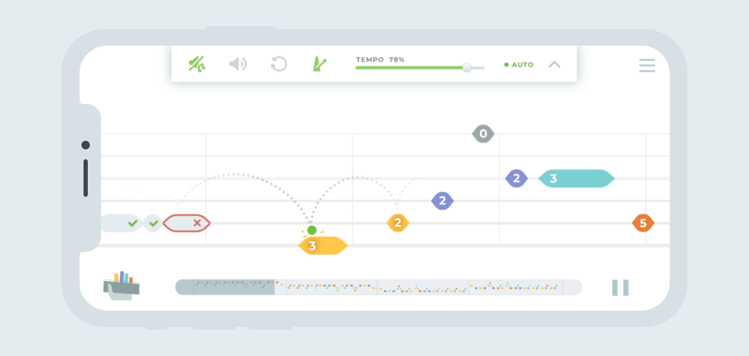
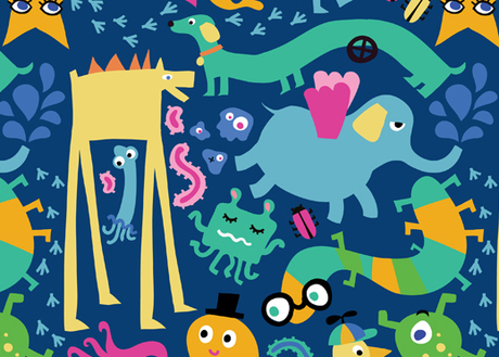
In my opinion, Yousician can afford to bring more fun in the process of education so I have added the funny illustration in the app itself. I used Yousician's green to keep the brand identity.
I have kept all functionality and structure of the app but rearranged menus and panels in a more familiar way for iOS users. I have found the existing navigation pretty tangled for newcomers and tried to bring more simplicity putting main actions on the first level. It makes the app looks more easy-to-start and fits everyone.
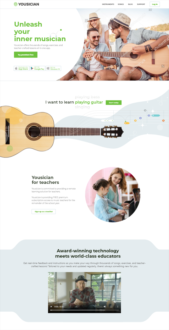
On the landing page, I am trying to develop and enrich this impression with photos. There might be a carousel on the main screen with photos illustrating socializing through music rather than about the educational process itself, for instance: family evenings, cozy parties and holidays, wedding performances, etc. Besides, I think using only illustrations with funny drawn characters instead of photos might be also an option to consider.
The illustration I placed below a hero image is obviously pretty raw and requires more work. But the main idea I would convey there is to illustrate how the interface works, show the beauty of the idea of turning strings into tablature.
I have done only the first couple of screens of the landing page to demonstrate the visual approach.